Welcome to the Lorphic Blog, your prime destination for cutting-edge trends and expert insights. Our meticulously crafted articles cover an array of topics, from groundbreaking tech to cultural shifts. Enrich your knowledge and stay ahead with every read.
Short answer: To make your website AI-readable in 2026, you need content AI systems can extract quickly, verify confidently, and trust enough to surface in answers. That
The uncomfortable truth businesses are starting to notice There’s a pattern showing up across SEO campaigns right now, and most agencies aren’t explaining it clearly. Companies are
The way people search online is changing faster than ever, and Generative Engine Optimization (GEO) is leading this transformation. AI-driven platforms such as Google’s Search Generative Experience,
Programming has always been a field where humor thrives in the darkest corners of debugging sessions and late-night coding marathons. Web developers have mastered the art of
Introduction Establishing a solid online presence is not a choice any more but a requirement for businesses. If you’re creating a new site or revamping an existing
Putting up a website can be daunting, particularly if you’re just starting out in the online universe. Two words you’ll hear repeatedly are website hosting and domain.
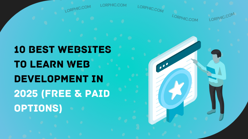
Introduction Web development is no longer a specialty skill. It has become one of the most desirable careers in the online world. If you’re a developer seeking


