Welcome to the Lorphic Blog, your prime destination for cutting-edge trends and expert insights. Our meticulously crafted articles cover an array of topics, from groundbreaking tech to cultural shifts. Enrich your knowledge and stay ahead with every read.
If you have searched Google recently and noticed that something feels different, you are not imagining it. The familiar row of ten blue links that has defined
Programming has always been a field where humor thrives in the darkest corners of debugging sessions and late-night coding marathons. Web developers have mastered the art of
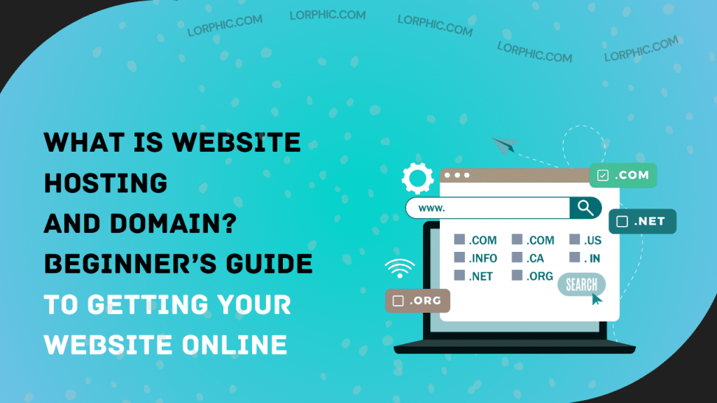
Introduction Establishing a solid online presence is not a choice any more but a requirement for businesses. If you’re creating a new site or revamping an existing
Putting up a website can be daunting, particularly if you’re just starting out in the online universe. Two words you’ll hear repeatedly are website hosting and domain.
Introduction Web development is no longer a specialty skill. It has become one of the most desirable careers in the online world. If you’re a developer seeking


